
Comidor offers an easy way to create visual reports via Widgets. By taking advantage of the data that is stored inside Comidor, users can create visual graphs that can be of great assistance in the decision-making process.
Create a Widget
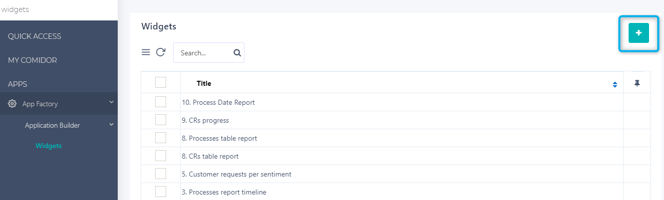
In order to create your customized Widgets, go to:
- App Factory Icon > Application Builder > Widgets.
- Click on the “+” button to create a new one.
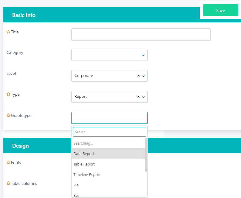
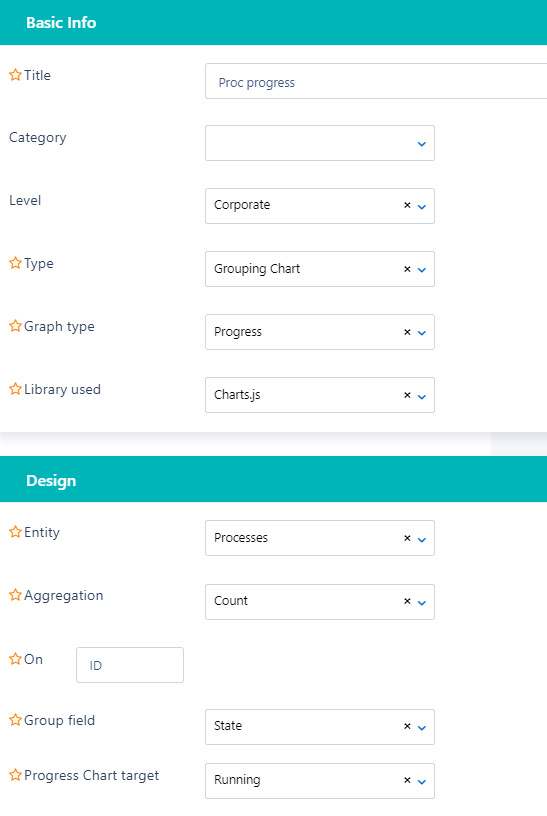
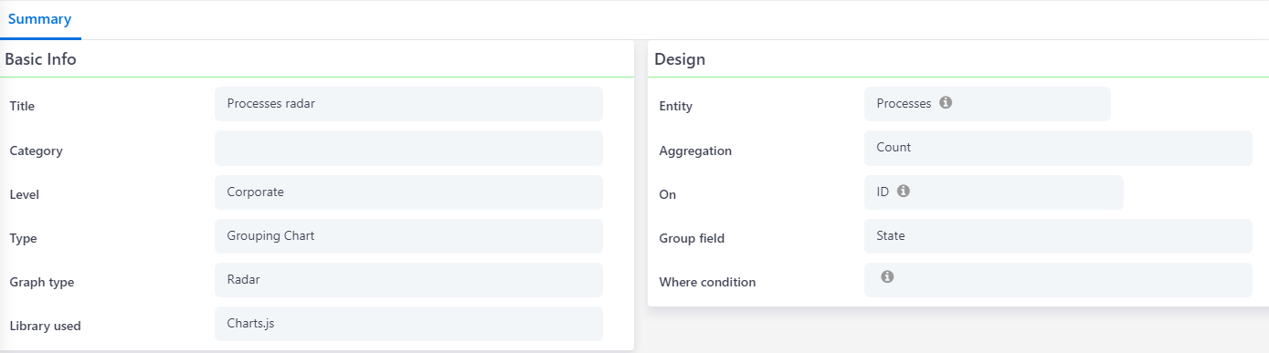
- Give a Title to your widget.
- Select a Category for your widget. Based on the data access, you can define the access levels (Personal, Team, Corporate).
- Select one of the four types: Report, Grouping, Conditional Grouping (the latter is used by advanced users who are able to write SQL queries), and KPIs.
- Choose the preferred Graph type:
- For report type: Date Report, Table report, Timeline.
- For grouping/conditional grouping: Pie, Bar, Horizontal Bar, Line, Doughnut, Progress, Radar, and Tube.
- Based on the graph type you choose, different fields need to get value based on a dynamic form.
- There are two Libraries available. Charts.js is available for all graph types, Apex Charts is available only for bar and line types.
Types of Widgets
In the widget creation, as described above, you are able to select among different types of widgets based on your needs. The four widget types are Report, Grouping, Conditional Grouping, and KPIs.
Comidor enables you to create your visual reports based on multiple graph types (Bar, Pie, Line, Doughnut, Progress, Timeline, etc.) as well as create bar charts, pie charts, etc.
- Based on the graph type you choose, different fields need to get value.
See some examples below.
Report
- In Report type, you can select Date Report as the graph type.
- Select the Entity from which the data is going to be retrieved.
- Choose between Count or Sum in the Aggregation field and type in the field that the aggregation will be applied to. Use database names for the fields you choose.
- Define a date field (e.g. the Date created) as a condition to your report.
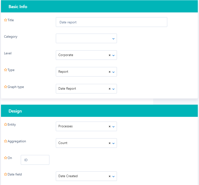
- You can use Count on ID, to measure how many records this entity has in total.
- Alternatively, use Count/Sum on another numeric field of the selected entity.
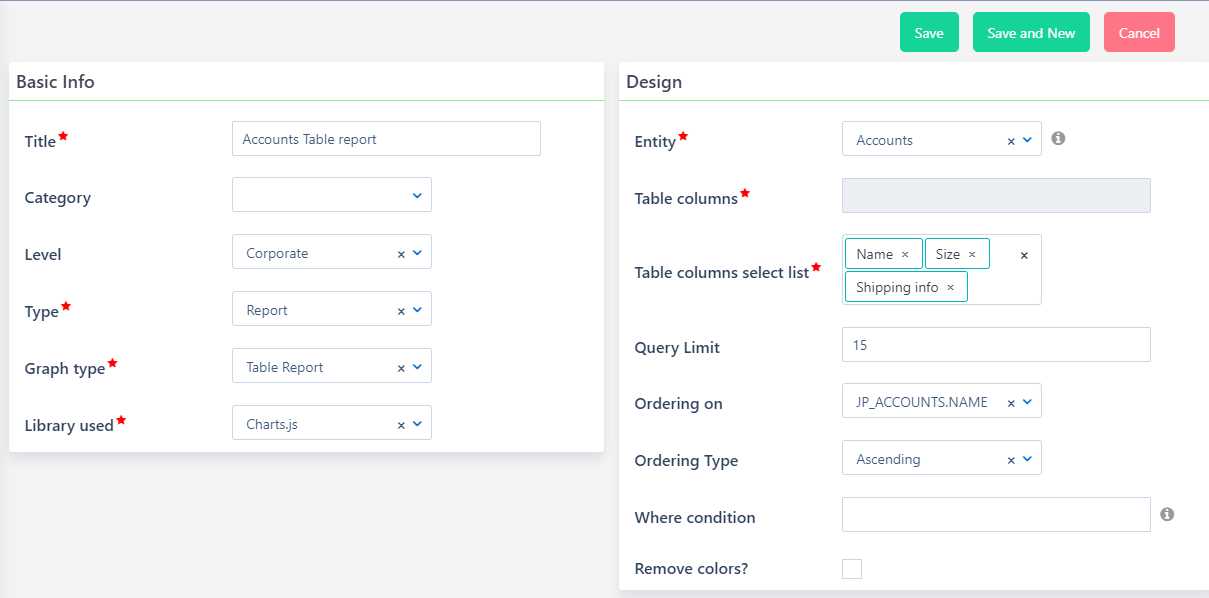
- In Report type, you can select Table Report as the graph type.
- Select the Entity from which the data is going to be retrieved.
- In Table columns, you can define the user fields (at least 2) to be displayed as table columns in your report.
- Add a number as a query limit. This refers to the number of rows to be displayed in your report (if left empty, it will display by default 10 rows).
- Ascending or Descending order is also available either based on the aggregation or on the grouping field. Choose the Ordering on and the Ordering type respectively.
- Limit your chart results, by applying a where condition.
- Finally, define whether you want to have colors in the list value fields (state, priority, etc) or not, by checking the “Remove colors?” option.
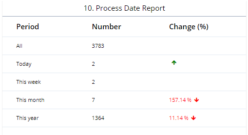
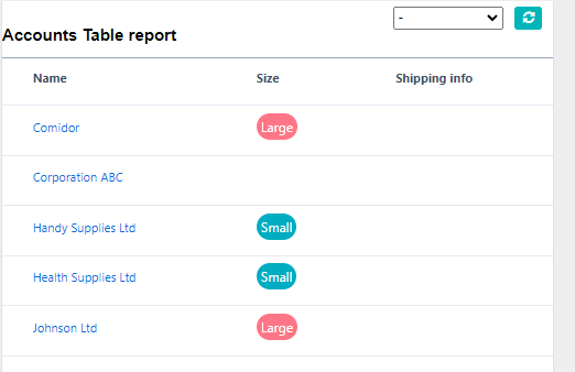
After saving your widget, you can see the preview on the top right of your screen.
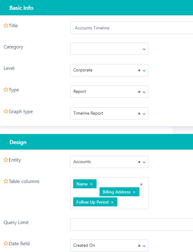
- In Report type, you can select Timeline Report as the graph type.
- Select the Entity from which the data is going to be retrieved.
- In Table columns, you can define the user fields (max 4) to be displayed as information in your report.
- Add a number as a query limit. This refers to the number of rows to be displayed in your report (if left empty, it will display by default 10 rows).
- Finally, define the date field (e.g. Created On); the timeline of your report.
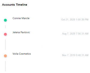
After saving your widget, you can see the preview on the top right of your screen.
Grouping
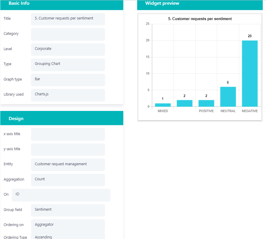
Graph type can be either Pie, Bar, Horizontal Bar, Line, Doughnut, Tube, Radar, or Progress. Select the entity you want and define the Aggregation field. Do not forget to select the Group field you wish the data to be grouped by. Ordering based on aggregation or grouping field is also available as well as the ordering type (ascending, descending).
1. For bar charts, you can choose the preferred Libary (Charts.js or Apex Charts).
- You can also give the title that will appear on the y-axis and x-axis.
- Add Aggregation Count on a numeric field if you wish to get a report with the total instances of each value for this specific field.
- Ascending or Descending order is also available either based on the aggregation or on the grouping field. Choose the Ordering on and the Ordering type respectively.
- Limit your chart results, by applying a where condition.
- See the Bar Chart example below:
2. In Tube graph-type charts, you have to choose Apex Charts library.
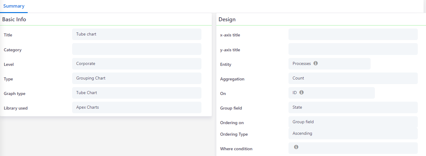
- You can also give the title that will appear on the y-axis and x-axis.
- Add Aggregation Count on a numeric field if you wish to get a report with the total instances of each value for this specific field.
- Ascending or Descending order is also available either based on the aggregation or on the grouping field. Choose the Ordering on and the Ordering type respectively.
- Limit your chart results, by applying a where condition.
- See a Tube preview example below.
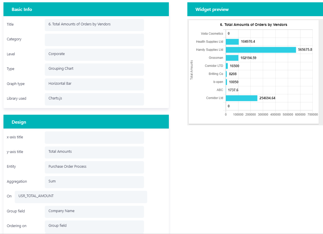
3. See a Horizontal Bar example below.
- You can use Aggregation Sum on a numeric field if you wish to get a report with a summary of the values of all entries in a specific field.
- Ascending or Descending order is also available either based on the aggregation or on the grouping field. Choose the Ordering on and the Ordering type respectively.
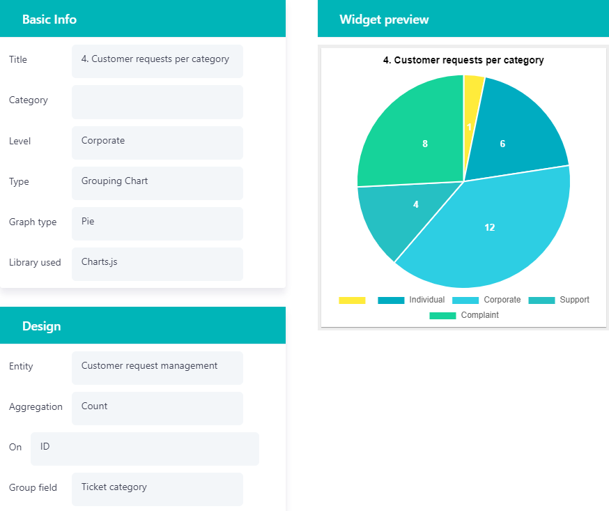
4. Another Graph type available for Grouping Charts is Pie. Select the entity you want and define the Aggregation field. Do not forget to select the Group field you wish the data to be grouped by.
- See a Pie Chart example below.
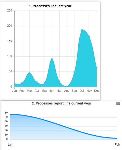
5. For Graph type Line, give the title that will appear on the y-axis and x-axis, select the entity you want, and define Aggregation. Choose an option in the date field (Created on, Updated on, etc.), the Date field group by prefix to be either Month or Day (this will define the x-axis) and the rolling period will define the data to be depicted in your graph.
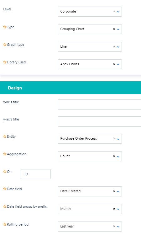
- See Line Charts examples below.
- For line charts, you can choose the preferred Libary (Charts.js or Apex Charts.)
- Apex Charts can be downloaded in SVG, PNG, or CSV format.
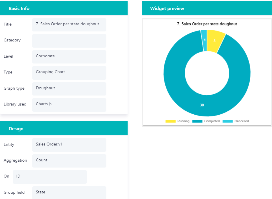
6. For Doughnut graph type widgets, select the entity you want and define the Aggregation field. Do not forget to select the Group field you wish the data to be grouped by.
- See the example below.
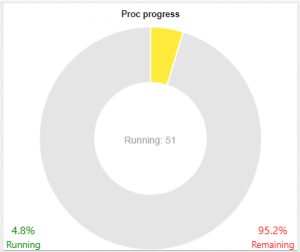
7. For Progress graph type widgets, select the entity you want and define Aggregation. Do not forget to select the Group field you wish the data to be grouped by (a drop-down field e.g. state of the process) as well as the progress Chart target(an option of the drop-down field).
- See the example below.
- The chart will display the total number of instances in the target state Vs all the other options (scheduled, completed, etc.).
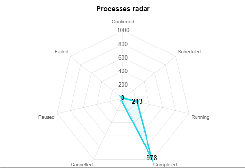
8. In the Radar graph type, you have to choose the Charts library.
- Add Aggregation Count on a numeric field if you wish to get a report with the total instances of each value for this specific field. Alternatively, add Aggregation Sum on a numeric field, to get a report with the summary value for this specific field.
- Ascending or Descending order is also available either based on the aggregation or on the grouping field. Choose the Ordering on and the Ordering type respectively.
- Limit your chart results, by applying a where condition.
- See the example below.
Conditional Grouping
Graph type can be either Pie, Bar, Horizontal Bar, Line, Doughnut, or Progress. Select the entity you want and define the Aggregation field. Do not forget to select the Group field you wish the data to be grouped by. Ordering based on aggregation or grouping field is also available as well as the ordering type (ascending, descending).
- Type a Where condition in case you want to limit the information that will be displayed in the chart.
For example, a process may have several states (Opened, Scheduled, Running, etc.). In this widget, we can monitor only the Running and Completed processes. So, we select Count on ID (how many processes), set State as Group field, add “Completed state” and “Running state” in the Label fields, and the Code that each state has in the Condition.
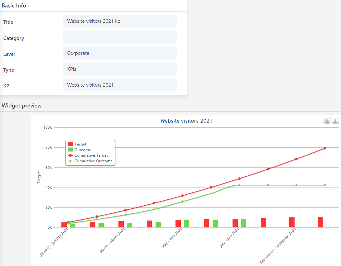
KPIs
Another option available for Widgets is KPIs.
- Simply choose the Type of KPIs.
- In the KPI field that will appear, choose on KPI record from the list.
- After saving the widget, you will be able to see the chart from the selected KPI that presents a timeline with the targets and the outcomes.
Find out more about KPIs in Comidor and how to create them.
My Widgets
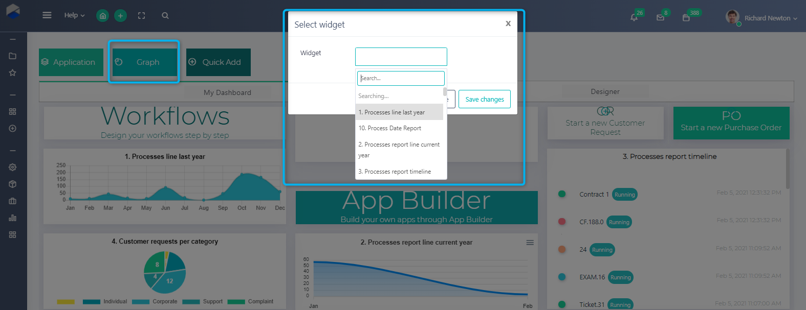
You can monitor the widgets you are most interested in, from one place in your Home Dashboard.
In order to add the widgets in your Home Dashboard, which is a personal dashboard:
- Click on the pencil button.
- Drag and drop the “Graph” tile in your dashboard.
- Search and select the Widget record you wish.
- Click on the “Save Changes” button.
- The widget is now added!
- You can re-arrange, re-size and delete your tiles.
You can also create Widgets through App Designer and also present them in tabs of applications. Check out steps 3 and step 4 of App Designer.